About My Designs
Provided below are answers to some basic questions with the intent for you to better learn about the media that I create.
VEKTR0
Introduced with the debut of the VEKTR0 alias in 2015 came first VEKTR0 design. Starting out with just custom lettering, v1 later received a mascot that varied depending on its use-case. The face was inspired by Barely Alive's logo. Parts of this original logo were carried on in fl0manel, until fl0manel was retired with the introduction of VEKTR0.10.
VEKTR0fox
In January 2017, shortly after the debut of the VEKTR0 persona and design, I released the first fox logo. Originally titled "VEKTR0fox", it took inspiration from the original VEKTR0 logo to create a sharp, unique look. Admittedly, it was pretty awful.
VEKTR0designs 2
Coming several months after the release of the VEKTR0fox design, and nearly a year after the debut of the VEKTR0 persona, June 2017 saw the release of a combined release. This brought with it a new and severely improved fox design named after my original persona, "fl0manel". Along with fl0manel came a brand new font choice for the VEKTR0 name that was drawn out by myself.
VEKTR0designs v3
In November 2017, the third version was introduced with an admittedly-worse fl0manel design and the same font for VEKTR0. Later on, in January 2018, the introduction of gradients and my first attempt at neon-inspired designs released. Shortly after, I started creating month-based designs using gradients of colors related to a significant holiday of the month. May 2018 saw the introduction of the "Hi I'm Ro" tagline.
VEKTR0designs v4
In June 2018, version 4 released. This update brought fl0manel away from the fox life and turned him into a lynx. This update also brought a new font for VEKTR0. No variant of version 4 could be found without neon.
VEKTR0 v5
Just a couple of months later, in August 2018, VEKTR0v5 came with an updated fl0manel with reduced lines. Every other aspect of the design was essentially the same as version 4. The neon inspired similar designs, and a light and dark variant of the design were introduced from the design's start.
VEKTR0v6
VEKTR0v6 released in July 2019. fl0manel returned to fox form, but significantly sharper. I returned to my roots by creating my own font for the VEKTR0 lettering. Later variants would include gradients, a revamped neon, and a shift in the logo's general layout. This would lead to VEKTR0v7 in 2020.
VEKTR0v7: PR0JEKT_F0CUS
Someway, somehow, during the absolutely absurd year of 2020, I still managed to create a better logo. fl0manel received some curves (a first in the history of my designs), but became obstructed by the bolder, sharper VEKTR0 lettering. While actual releases of variants became disrupted by, well, 2020, I did a lot of work behind the scenes to create some of my best themes yet. In late January 2021, a wallpaper pack was released exclusively on my Discord server to showcase the different designs that were mostly never seen before. VEKTR0v7 acted as a break from my neon designs, while I focused on bringing an entirely revamped neon method for VEKTR0v8.
VEKTR0v8: Neon Evolved
Released in Summer 2021, VEKTR0v8 is the perfect follow-up to VEKTR0v7. I went back to the drawing board. Well, actually, I went back to the graph paper that I printed on the printer at work. That's not the point.
I didn't want to start completely from scratch, but I didn't want all elements to stay the same as the previous design change. Working off of that, I crafted a design that I felt perfectly complimented the aesthetic of my brand, while still feeling new, all at the same time (not sorry, Raistlyn). fl0manel was redone all-around, with sharper corners, and looked a lot sleeker with the addition of a lot more curves. Curvy baby, indeed, Jase. The VEKTR0 lettering was modified letter by letter. The "V" was narrowed to fit the uniform width of other characters. The "E" had a shortened middle stub or whatever you call that thing in the middle. The "K" had also been narrowed, while the "T" had a curve added that you honestly wouldn't have noticed if I hadn't said anything about it. The "R" had more curvature to it, and the funny part is that the curve of the leg of the "R" was done accidentally, but makes it just that much more unique. The top of the zero was extended a little bit, but was otherwise not modified.
While all of this felt like enough for a major design release, I wanted to do more with it. The main problem that I had with VEKTR0v6 and VEKTR0v7 was that a lot of fl0manel was obstructed by having the lettering layered above it, covering up bits that really would have made fl0manel's features stand out. This time around, VEKTR0v8's lettering was made a little bit smaller, to allow the main cutouts of fl0manel to stand out.
Previous iterations of my designs have featured a neon appearance, with VEKTR0design v4, VEKTR0v5, and VEKTR0v6 having neon as the main theme. This made a return with VEKTR0v8, and I went back and started from scratch with a new way of handling the neon appearance. To start, each logo element had four layers. Starting from the top layer, the main logo element had color added as part of each theme. The layer below was a duplicate, but with 10pt gradient blur added, with the layer below that having 25pt gradient blur. Underneath all of that was the main logo element, in white, to allow the top layer to pop out more. This design came with the usual release content (graphics for social media, and animations for my YouTube content), but also included a wallpaper pack, with an exclusive version that released for VIP's a week early with extra wallpapers.
VEKTR0v9: fl0manel's Final Voyage
Released in February 2022, VEKTR0v9 is considered a definitive edition of my designs that really compliments the aesthetic that I, as a graphic designer, have been trying to really narrow down and embrace. Like with VEKTR0v8, I went back to graph paper to redraw, then take it digital, then alter it, and then master it.
As suggested in the title, VEKTR0v9 is the final planned design for fl0manel. It was a hard decision to come to, but still very much needed. In short, my designs over the past few years have been based around their previous designs. As a creator, this has been a pretty lazy way of going about things. With fl0manel, my aim was to embrace what has worked in past designs, one last time, to create something entirely new but familiar. The goal was something that felt mastered, something perfect, and something that really compliments what fl0manel has meant to my brand for the past 5 years.
When it comes to the VEKTR0 lettering, some curves were made smoother, and the lower half of the V was redone so that its width on the diagonal parts are more uniform with the rest of the design, as well as the very bottom being sharp instead of curved. The size of the lettering is smaller to help emphasize fl0manel, with the total width of the VEKTR0 lettering being the same as with fl0manel's.
As for fl0manel's update, this one is more substantial. The top has been redone with new spiked out ears, and the notch has been sharpened dramatically. The sides have a 3-piece spike, where it was previously 2 pieces. A lot of changes were made afterwards that are too small to record.
As for the backgrounds, I've gone with several 2-color gradients, angled to go perfectly diagonal from the bottom left to top right corners. At the time of release, VEKTR0v9 features 9 gradients that are available in a Release Edition wallpaper pack, which was made exclusive to VIP's on my Discord server for 1 week. Given that this is fl0manel's finale, I decided to push the next design until 2024 to allow me more time to play around with this design and release more amazing wallpaper packs. This also gives me more time to properly plan for a design that will embrace my brand while being entirely new. Along with the intial wallpaper pack that released at the design's launch, there has been another wallpaper pack featuring awesome shots from Forza Horizon 5.
The final VEKTR0v9 design releasd on December 17th, 2023.
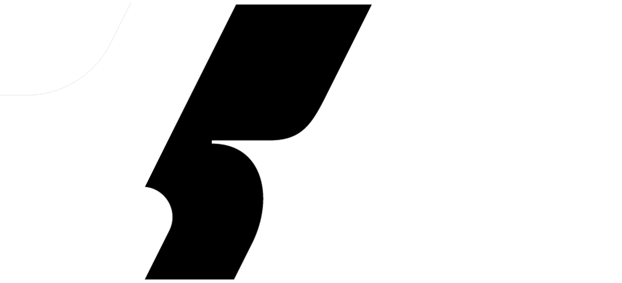
VEKTR0.10: A New Era. - Current Design
Introducing a whole new design for VEKTR0, complete with a brand new, designed-from-scratch logo. This is a new era. As we say goodbye to fl0manel, we say hello to a completely different, never-seen-before design that really captures the best elements of previous designs, but with a more modern, unique twist.
After dozens of concept designs, all fairly unique from each other, VEKTR0.10 showcases a completely different approach. While still featuring the neon look and sharp (but curved) lettering seen on previous logos, the new slanted approach gives VEKTR0.10 a fast-paced feel that really embodies the content seen on the YouTube channel. This logo is also designed to emphasize the number 10, which is seen within the 'R0' lettering.
The design started being trickled out across social media platforms throughout December 2023, and officially debuted on December 31st, 2023. On New Years Day 2024, it makes its debut on the YouTube channel, complete with brand new animations, which also extend to new animations for Bad Fellas Media Group.
What equipment do you use to create your designs?
A majority of my designs are made on my PC, and my files are synced to Adobe Creative Cloud, so that I can work on my designs on my 2020 Apple M1 Mac Mini and 2020 Apple iPad Pro.
What programs do you use to create your designs?
All of my designs are created with Adobe Creative Cloud applications Illustrator CC and Photoshop CC. Illustrator is used to create the vector designs, while photoshop is used for layering and final production. After all of this, is use Adobe After Effects CC to create the animations for my YouTube channel, using templates from Envato's Video Hive service.